Dashboards have become a ubiquitous part of BI. With their trend lines and bar charts, dashboards make it easy to visualize and digest complex analytics and drill down to underlying factors. With these “data stories” executives can more easily mine data and be competitive. Power BI, Cognos and Tableau each offer dashboarding functionality, but that doesn’t mean they are all the same.
In this on-demand webinar, we look at dashboarding across three big enterprise BI platforms. Through direct comparison and demos of Power BI, Cognos and Tableau, you will get a good grasp of the capabilities for each.
- Check out the dashboard UI for each tool, gauging them for intuitiveness.
- Learn the pro and cons of each.
- See how each deals with data preparation and building visualizations.
- Get a side-by-side comparison of the same data presented in the different dashboards.
If you are having BI dashboarding FOMO or are wondering if there is a better analytics tool for your business, this is your chance to see these three tools demo’d side by side.
Presenter
Pat Powers
Trainer and Consultant
Senturus, Inc.
Pat is one of our most popular presenters, regularly receiving high marks from participants for their subject matter knowledge, clarity of communication and ability to infuse. Pat has over 20 years of experience in data science, business intelligence and data analytics and is fluent across multiple BI platforms. They are a Tableau Certified Associate and well versed in Power BI. An expert in Cognos, their product experience goes back to version 6. Pat has extensive experience in Actuate, Hyperion and Business Objects and certifications in Java, Python, C++, Microsoft SQL
Read moreMachine transcript
Welcome to our dashboarding comparison of Power BI Cognos and Tableau for 2023.
4:10
Well, we already have our first question.
4:13
Hey, look at that, Jerry, please discuss the ability or limitations with connecting to multiple types of databases. Well, that’s not what today’s topic is going to be on.
4:28
We’re focusing today on databases, but let’s circle back to that a little later on. Today what we’re going to be doing is comparing the dashboarding capabilities of these three tools.
5:01
So here we go.
5:03
Got questions? The Q&A at the bottom of your screen, you got both the chat, you got the Q&A. Welcome to the Q&A. You can type things, I see them, I see everything.
5:14
Of course, the very first question we get asked is how do I get a copy of this presentation? Well, visit the Knowledge Center on the Senturus website or if you take a look at that chat window you will see.
5:29
There is a link to it. I’ve got it ready.
5:33
So if you take a look in the chat window.
5:37
You can grab this copy of this presentation, you’ll be good to go.
5:42
But do visit our Knowledge Center. We’ve got lots of good stuff on our Knowledge Center. Just had another question come in from Jared. Are these platforms considered solutions dealing with big data? Big data is a misnomer. Big data is not something real. Big data is relative to whomever you are speaking to. Yes, all three of these platforms can handle very large databases to answer your question directly.
6:04
So our agenda today.
6:07
It is very confusing Jared and I would recommend taking a look at Stephen Fuse’s book Big Data Big Do.
6:14
So our agenda today.
6:17
You’re going to find out who I am, who this crazy person talking to you is. Some of you know me, some of you are very scared already. That’s OK then we’re going to talk about what our dashboards, because I think that is a term that is very confusing to a lot of people. There is a big difference between a dashboard and a report. We’re going to talk about those differences and we’re going to see what the real, what is really a dashboard? OK. It’s just like scorecard dashboard, report, dashboard style, all these terms.
6:50
Then we’re going to look at how to build one in each of the tool. What is the tool, what are the parts of the tool, if we’re looking at the parts of power BI versus the parts of Cognos, etc. And I’m going to build and I’m going to build the same dashboard in each of the three tools.
7:09
Lastly, we’ll wrap up with our overview of Senturus where you can find additional resources and then if somehow magically I didn’t manage to answer your questions, we got some Q&A time depending on how things are going.
7:23
All right, let’s start with this. This is me, Pat Powers, data scientist, consultant trainer, general pain in the you know what? So this is my 26th, 27th year. Data science, data analytics, data warehousing, data. I’ve used every tool you can imagine. I’ve used Cognos, Power BI. heck, I’ve even used things like Actuate and Crystal.
7:53
And they had SRS and all the fun stuff back in the olden days.
7:59
I am certified in many things. Certified in SQL, Tableau, Cognos.
8:12
Multiple programming languages. I’m old, I don’t get to leave the house much.
8:17
But that’s OK.
8:19
Now, our very first thing we’d like to ask you as a poll. We’re going to have a poll because we’d like to know where you’re coming from. We’d like to know what you’re currently using. We’d like to know what you’re doing because if at any point you do want to switch, you want to know where you’re starting from. And you may have noticed in the chat window, Scott Felton, our wonderful managing director, put a link in there so you can get on Scott’s calendar.
8:43
If you want to talk about switching.
10:02
Interesting. But as you can see in the majority of you are split between Power BI and Cognos. Thank you, Susie. And thank you Angesom. I told you all, it’s not me just getting used to this interface. Look at that though, 68%, 69% of you coming in there with Power BI and Cognos, smaller percentages with Tableau and other, and luckily, I have zero. I don’t knows.
10:40
Let’s get into the important part. So first off, what is a dashboard?
10:50
Irrespective of the tool.
10:52
No matter what tool we’re talking about, there’s going to be some commonalities, OK?
10:58
In general.
11:01
A dashboard is a collection of objects, whether depending on the tool, they’re going to be named different things. Whether it’s a widget, a report, a button, an image, whatever it is, it’s a collection of objects.
11:16
And those objects are going to be shown on pages. Again, depending on the tool, it might be tabs.
11:23
And it’s going to allow you to quickly and easily see your day.
11:28
That is the general concept of a dashboard.
11:34
So what makes that different than the dashboard style report?
11:40
Thank you, Kenny. With that technically. So two questions came in. Gary asked, can you tell us more about your dog? Her name is Pip. She’s nine years old. She’s deaf and she’s a very good dog. We’re getting a new dog in March. So in March, you’ll see a new dog pitcher. Kenny has the tallest. The word dashboard came from horse drawn carriages put between the horse and the driver. Stopped the horse from dashing up mud on the driver. Look at that. You all learned something else new today. Thank you, Kenny.
12:09
One thing that’s important about dashboards.
12:13
Is dashboards should convey summary information. And I want you to think about, you know, let’s think about even what Kenny just said about the dashboard in a horse drawn carriage, OK?
12:25
And that’s the fact that you want something that’s there, that’s quick, that’s easy. But let’s talk about the dashboard in your car for a second.
12:34
If your dashboard in your car had a 5000 row scrolling list report.
12:43
Or if the dashboard in your car took a minute and 1/2 to show up.
12:49
I’m pretty sure you would turn that car in.
12:53
Pretty sure you would get rid of that car.
12:56
The same logic applies here.
12:58
A dashboard should be summary information.
13:03
That lets us drill down or drill through to detail.
13:10
Jared, your comment that we should rename that to Visual Display management, that’s actually a really right on the money comment.
13:19
OK.
13:21
There really is.
13:24
Because you’re right, it is about a visual display and it’s about getting it quickly and easily. So what makes that different than a report? What makes that different than a standard dashboard style report?
13:41
One of the big differences is that dashboards can come from multiple data sources.
13:48
Dashboards are collections of widgets.
13:52
Dashboards can have one widget that comes from your inventory system, one widget that comes from your sales system, a widget from your HR. These don’t have to be linked.
14:05
There literally has to be. There does not have to be any relationship on the back end.
14:11
To these different widgets.
14:14
It’s a collection of data to help someone do their job.
14:20
It’s a collection of data to help someone see what they need to see, to make business decisions and to take action.
14:31
That’s the focus of a dashboard.
14:35
You really typically are looking to put actionable items into that.
14:42
Again, you might be drilling down to detail level.
14:47
You might be drilling through to more different data to do another level of data.
14:53
But you’re looking at something as a summary.
14:56
And you’re starting out with all of the pieces that work for you.
15:03
And that’s a big distinction between a real dashboard and a dashboard style report.
15:09
And here’s a good example of that.
15:13
On the left is a true power BI dashboard.
15:17
On the right is a dashboard style report.
15:23
To most consumers of this data, there’s no difference.
15:28
I still see charts. I still see visualizations. I still see buttons.
15:35
But it’s the nuance of this.
15:39
This data could be from 10 well 1,2,3,4,5,6,7,8.
15:48
This could be from 8 different data sources.
15:55
And Jared, that is also another thing and now you’re getting a little more tool specific. Jared’s comment is that reports seem narrowly focused. Well, reports may seem narrowly focused because remember, reports are more than likely coming from a single data source, right. So there is more of that focus because it’s focused on that data source.
16:16
And reports may be past tense.
16:19
Whereas a dashboard may be refreshed more frequently.
16:24
A dashboard maybe something that’s.
16:28
RNT it could be a near real time piece of information.
16:36
There’s also going to be, depending on the tool, different things that you can do with the dashboard, such as asking questions about your data, such as sharing this in teams.
16:49
We also start looking at the distribution depending on the tool.
16:54
Are we using this to do analysis? Are we using this to distribute it? Are we using this?
17:04
In a different way on are we putting this on public display?
17:10
In a past life I have was at a place where in the knock there was a giant TV screen that had a regularly updating dashboard showing status of machines and disk space and things like that.
17:26
So how are we using this? That’s going to depend. Now. That’s where we start getting into the tool.
17:35
That’s where we start getting into more specifics.
17:40
Before I start getting into that, we all doing good so far. Everybody doing great. Let me make sure I didn’t miss anything. Gary, I got your Marina.
17:54
Marini’s question is, there something similar to Cognos Cubes in Power BI?
18:01
Stored up.
18:03
You can do all app in power BI.
18:11
So you can have all app cubes in there.
18:15
Not a topic for right now, but what I would do is I would suggest that you.
18:21
Click on that link in the chat window to get with Scott for 15 minutes and you guys can discuss how to use cubes in your power BI environment. I think that’s everything I think I got Jared. Thank you.
18:35
You know, if I have to sit here talking to myself, basically.
18:39
I’m going to have fun with it, and I hope you all have fun with it too. So let’s get into the details.
18:49
How did we make these decisions and how did we do these things with the tool well?
18:55
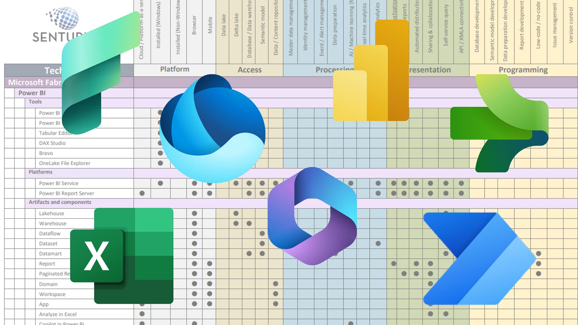
Not only did we Senturus make a decision about comparing tools for dashboarding.
19:03
We have a chart.
19:07
And that chart looks at 150 different aspects of the tool.
19:15
All three tools and it ranks them on different things. It ranks them on things like product improvements, visualizations, report functionality.
19:27
We have that on the website where you’ll find different ratings, whether it’s 2,3,4, what the capabilities are.
20:20
Go to the Senturus website again, there’s a slide on it a little later on, and take a look at this chart because that will help you with some just bigger decisions.
20:29
Let’s start with Power BI.
20:36
This is one of the decisions you’re going to have to make depending on the tool.
20:43
We’re going to have to decide if we want to have locally installed products.
20:50
Or if we want to have everything through a single portal.
20:54
With Power BI.
20:56
You are actually not making dashboards in the desktop tool, you’re making reports.
21:04
In the desktop tool.
21:07
You are then publishing.
21:10
Those reports and datasets.
21:13
To your Power BI service.
21:17
In the service, you’re assembling a dashboard now that’s kind of a key there and that’s something that’s going to come up in a in a few minutes when we move on to the next tool.
21:31
In Power BI, I’m assembling a dashboard that is coming from reports that have been built in the local desktop tool and published to the service.
21:52
Those reports can be from many different data sources.
21:58
They can be from things that have come through the gateway, they can be from different apps, they can be from different places. But to build a true dashboard in power BI?
22:08
Which is the only place that I can set up subscriptions and other things I have to use the service. So I’ve got two tools essentially.
22:18
I’ve got power BI desktop, I’ve got power BI service, and for that let’s take a look.
22:27
Here you see, I’ve got my Power BI.
22:30
I’ve got two different sets of data that I’ve brought in. I’ve brought in some sales data.
22:42
So I’ve got some sales data.
22:45
That’s these dim tables and fact table right here. And then I’ve also got some inventory data.
22:53
Two different datasets.
22:56
Here’s my canvas. So what am I building on my canvas? Well, I’m just going to throw some visualizations out there, so I’m going to build.
23:05
A dashboard style report.
23:10
Remember that word? This is a dashboard style report and there’s absolutely nothing stopping me from publishing this as it is OK, I can publish this report.
23:26
Out to my service as well.
23:28
There’s nothing saying that I can’t publish this out to my service.
23:41
And then down below I can throw another one.
23:46
But what do I have here? Do I have a dashboard? No, I have a dashboard style report.
24:01
Slicers. I still have this and then you know, I’m just going to work this real quick here.
24:07
Just going to make some nice fancy things out of this.
24:31
And here I’m building a report.
24:48
And look at that and can I change how this looks of course with some nice buttons make this look fancy.
25:10
Look at my buttons. Everybody likes buttons and I could just give this to a user as it is.
25:17
Alright, it’s got filtering, it’s got everything but.
25:24
This is technically a report.
25:28
If I wanted to share this, I’ve got a couple options. I can send somebody my PBI X and then they can go ahead and then they’d be able to edit things. They’d be able to change things. I could publish this out as a report.
25:42
Not necessarily Michael’s question was if you had filters and it’s a dashboard style report. When I say dashboard style, what I’m talking about is a collection of objects. OK, so I have three objects on here.
25:56
That’s what makes it a dashboard style in my terms.
26:02
I’m simply saying that, hey, it doesn’t necessarily have to be a dashboard to have filtering, to have all these other things. I can still do this in a report.
26:12
So now if I wanted to create a second tab.
26:15
And I wanted to do one for my inventory, right?
26:19
So my inventory is coming off this.
26:30
So Jared again and to every body.
26:33
Dashboard style means that it’s a collection of objects.
26:41
When people think of a dashboard, they think of multiple objects on a page.
26:45
This is technically still a report, but because I have multiple objects on the canvas.
26:52
People think of it as a dashboard, so that making sense to everybody. What I mean by that.
26:58
I’ll repeat that as many times as we have to. I want to make sure everybody stands.
27:05
A dashboard to most people is a collection of options.
27:12
But this is actually not a dashboard.
27:19
OK, it’s still a report because I’m building it in this reporting tool.
27:28
Right. It’s a single report page, Jay.
27:33
Hey, it’s a single report page.
27:38
By the way, there was a question about the presentation. If the presentation was available, I just recopied the link into the chat window.
27:48
Each of these is a report page.
27:53
This is multiple visualizations on a single page.
28:03
All right. This is really, it’s, such a small nuance, but it’s something that people get thrown off by.
28:11
This is still a report, it’s a report page. And if I were to save this.
28:19
I would save it as a workbook and that workbook has multiple pages in it and it has multiple sheets, worksheets and the worksheets may have one or more objects.
28:55
Mark, I see where you’re coming from.
28:57
About trying to build true power BI dashboards, right? So the reason. OK, so let’s get to that. Why would I build this into a dashboard? Why would I turn this into a dashboard? You know what I’m going to change my demo on? I’m going to do something crazy. I’m going to change my demo up.
29:22
But I need y’all to see this. I really need y’all to understand this.
29:28
Because this is important when you start thinking about your tool, so I’m going to save this one.
29:34
I’m going to get rid of this page, yes.
29:37
Hey, I’m going to save this.
29:42
And I’m going to save this one just as my overview, OK?
29:50
I’m going to delete everything that’s on here.
29:57
And instead, I’m going to build this, I’m going to throw a table on here.
30:05
And I’m going to put my inventory on here.
30:07
So instead of doing it in the in the same one, which is how I was planning on doing it, I’m going to take this.
30:22
Unit cost.
30:24
OK, I’m going to change that to an average. I’m going to do this really quickly here.
30:29
I am going to do my unit cost year over year. I’m going to add in some conditional formatting.
30:47
I’m going to save this as inventory.
31:00
So now I’ve got two. I’ve got overview in inventory. OK.
31:06
When I want to share these.
31:09
I’m going to publish them to my service.
31:13
So going to save and then publish.
31:39
So I’m going to publish this out to my workspace.
31:53
I’m going to reopen my overview one.
32:07
I’m going to publish my overview one to that same workspace.
32:13
So, I’ve got two different workbooks now.
32:18
Two different workbooks, OK.
32:23
This is where the distinction comes in, gang.
32:26
Here I am on my Power BI service.
32:31
And in my workspace.
32:36
Where are you? I’ve got my inventory and I’ve got my overview. So I published out two different datasets. I published out two different reports.
32:49
Could I just use this report? Could I just share this report? Sure.
32:55
And this is what you’re getting at, Mark.
32:58
Is what just sending this out instead of sending out a true dashboard, right? But what if I’m somebody who needs to see data from both at the same time?
33:15
These are not direct query, Jerry. They are import yes. So this data is and there’s no laptops in this house, OK.
33:26
My friend, this is 128 gig of memory on a very powerful machine. OK so yeah I’m able to do all this locally. This is why we have 128 gig of RAM on this machine. But if I want to build a real dashboard.
33:43
And I want to see both of these data sets at once.
33:48
I would pin this I am, Jerry absolutely. So, I would pin this.
33:57
And I’m going to create a new dashboard just so you all can see it. I’m going to do new dashboard. I’m going to call this webinar live.
34:09
And I’m going to pin this live, so anything that changes in the report changes in this dashboard.
34:18
Years the distinction, because now I can go back to my workspace. I can open up my inventory one.
34:29
And I can also pin this to my existing dashboard.
34:44
So, my dashboard.
34:47
Contains both sets of data.
34:53
That’s what makes a dashboard in Power BI.
34:57
Different than a dashboard style report.
35:01
Are we all on board with that everybody under? Does everybody see that, does that everybody have that aha moment?
35:09
I’ve got data from two different workbooks in a single layout.
35:20
So as the user as the consumer of this if I need to see both of this.
35:27
No, mark I can interact with this. My slicers are still fully working.
35:34
I can still interact with this.
35:37
I can also ask questions.
35:40
I could say, you know, hey, what’s my top color by unit cost year over year?
35:47
So I can still interact.
35:53
And I’ve got both now, though in a single place. That’s where the distinction is. Is there anything wrong with sharing this? No.
36:03
Doesn’t have to hang some. It does not have to. I’m saying that’s one of the features of it. This could I could have pinned a different report to this, OK, I could have pinned a different report that came from the same data source. It’s the ability to pin multiple objects from multiple sources, whether they’re the same data source or not, onto a single page.
36:33
That’s what we’re talking about here.
36:40
Gregory, you can. So, Gregory’s question was can I pin specifics? Yes.
36:48
Ok. And that’s also what makes it a dashboard because if I come in here.
36:55
And I take one for my last webinar or something, here’s the one I did on PBI portals.
37:02
I could pin just this visualization.
37:06
OK, I can pin no, apparently not this there is. I can pin just this one visualization.
37:17
So now I have 1/3 object on my dashboard.
37:24
And I don’t even know what data source that came from. I don’t even remember.
37:32
That is the catch mark if I want the same interaction.
37:42
I’m running out of time. I’m sorry. I’m going to Sandra. We’re going to get to Cognos stacks. Nicholas, I do need to get to this, but I think that there’s enough generic information in what I’m describing right now that’s not necessarily Power BI specific. That was good for everybody to hear this.
37:59
So I think that was good. No Angesom all this has to be done on the service. Sorry, I did go down a bit of a rabbit hole there because there were a lot of just general questions. But let me, switch over for a second. And again, this is why Scott put that link in the chat window. We can get into this with you offline. We can get into this more and more. But let’s talk about Cognos before I do run out of time. OK? With Cognos, I’ve got a couple different things I’ve got the ability to use.
38:31
Data modules.
38:33
So I can still upload my data sources, so I can have multiple data sources. I can use packages. So the questions came up, can I have different data sources? Sandra, you absolutely can.
38:44
With Cognos I can build either a very simple dashboard or I can build something very fancy. The everything I just talked about applied still to Cognos. It’s still multiple objects, it is still multiple data sources, it is still all these different things. Let’s see that in action. OK, so what’s the difference with Cognos?
39:06
In Power BI I’m using two tools. I’m using Power BI desktop and Power BI service with Cognos I’m using Cognos. I logged into my main Cognos portal, plain and simple. I have one interface; I have one starting place. I have one object.
39:29
I’ve already uploaded the same file, you just the same data. You just saw inventory data overview data.
39:38
I made a data module out of those uploaded files.
39:42
And now I can use this data module.
39:47
And I’m going to build, not assemble.
39:55
I’m going to build a dashboard.
40:03
So this is one of the differences.
40:06
Where in Power BI?
40:09
I was assembling objects.
40:13
Here I’m starting with my data module and here I am building one so I can still Add all these other things. Basically, everything you just saw me add. Here’s my pie chart. Look at that.
40:26
Same data can go on this. I can add the exact same thing.
40:36
And of course, there’s going to be slight differences in how things look. OK, everybody’s going to have their own different look and feel, the widgets.
40:44
But here are the same widgets that you just saw me build.
40:51
Here’s my line. There’s my pie.
40:59
But notice that I’m building live now. I’m not.
41:03
I’m not doing anything in terms of.
41:09
Assembly I’m building this out live so I’m taking that order date. I’ve got my year month.
41:19
There’s my, your month. I’ve got my order quantity.
41:25
Alright, so there it is. There’s the same thing going on. And then lastly down below.
41:33
This is just a regular Cognos view, Duraid. This is just this is what anybody who uses Cognos would see, assuming that they have the ability to build dashboards, assuming that is on their capabilities, that their group or role has the capability to do it.
41:50
Aye, nothing, fancy about this.
42:05
I want to put my total product cost on here. You’re welcome.
42:10
So yeah, if you’re using a different version, it might look slightly different just in terms of look and feel. But there’s nothing, special about this. There’s nothing unique about what we’re doing here.
42:24
But there it is. I can sort this by product cost.
42:30
So, I can make this look very similar to what you saw in my other one. Hey, what about filtering? Absolutely I can still do my same filters right?
42:41
So, here’s my country filter. Now the question asked out can I have multiple pages and power BI? No. With Power BI, it sticks them all right underneath each other.
42:52
When I do a Cognos one though, I can have multiple tabs so I can have wow I’d much.
43:04
I can have my overview tab.
43:09
That page on that, so it all shrinks.
43:13
And then I can have.
43:16
My inventory tab.
43:19
And here to the other question.
43:22
I can bring this in from different data sources OK, I combine these into a single data module just for the sake of time. But I didn’t have to. I could have these coming from different data sources. So, here’s exactly what you just saw on my other one, my inventory tab.
43:40
And then I’m just going to throw.
43:44
Unit cost out there?
43:50
But notice that I’m building.
43:53
Right, I’m building.
43:58
I’m not assembling.
44:01
I’m building.
44:05
So, where’s the difference?
44:11
The difference? Is that I don’t have to publish this?
44:14
I’m in the same tool. I’m in tool that the same exact tool. All I have to do is save this to a public area.
44:28
If I wanted to save this out to my demos folder.
44:33
Anybody who has access to my demos folder can access to that to that dashboard.
44:48
And here’s that dashboard. This is how it would appear to a user.
44:53
I’ve still got my filters.
44:59
I can still do analytics on this, so just like you saw with ask a question.
45:05
Correct Jerry, this is all happening on my server, not locally. I’m not importing, but look, I can throw forecasts. I can do narrative insights; I can still ask a question.
45:20
I can see what’s going on here and I could pin this.
45:26
To take it off to a story or an exploration. So, if I wanted to go deeper, if I wanted to dig more into this.
45:35
One tool, one place, one thing. All I had to do was copy this to a public folder and I’ve maintained my tabs.
45:48
So unlike Power BI where I was building in one tool and publishing out.
45:53
Here I did it all in one.
45:56
One license, one set, one thing. So, couple of the questions correct. Jerry, this is 1 license here.
46:03
Because I already have a Cognos license.
46:06
I don’t have to worry about having an a license for my app, for my app server, for my power BI service. It’s one and done.
46:19
So there are some questions that come through I don’t, think I’ve missed anything, move that last object.
46:25
No, Jay, that’s what I’m saying. It just stacks it right on top of each other.
46:30
Jeffrey, I can have a schedule set up for this.
46:35
I can’t have this all scheduled.
46:53
Monica yeah, this could be an on-prem. It can be cloud, either one.
46:59
Cognos offers both options.
47:03
The difference is I built in Cognos and I saved in Cognos. I have one login to Cognos, I have one tool. I don’t have to maintain anything in terms of local installs. My IT department doesn’t have to worry about it. My IT department doesn’t have to keep track of who’s got power BI desktop installed.
47:40
Mark, you do bring up a good point.
47:43
And I don’t want to ignore that.
47:45
There is the concept of apps in Power BI, which you’re absolutely right, apps do allow me to have different pages, different buttons, but I’m trying to focus specifically on dashboards.
48:01
OK, but you’re not wrong.
48:04
I want you are absolutely right, I can’t have different pages on an app, but that is a whole another webinar, isn’t it OK?
48:15
But for now, in a dashboard specifically, it stacks.
48:22
Jerry exactly I when I’m using Cognos, I have one data connection, I have one data module. That data module has one login. I’m not worried about different logins to my source.
48:36
So, there are advantages here.
48:39
There are definitely advantages, and I’m going to. I’ve got enough time, it’s going to be tight, but I’ve got enough time. There are pluses and minuses to all these tools.
48:49
So, let’s talk about this last one. Let’s talk about Tableau.
48:53
Tableau is kind of a hybrid.
49:07
Doug, I’m not trying to sound like a proponent of one product or the other either.
49:12
That’s you’re absolutely right. That’s why I wanted to touch on that thing about apps, because yes, I can. I can create with apps and have that one dashboard type of feel.
49:22
And you’re right, there are and again, This is why we did the chart everybody, because there are hundreds of features in all of these tools. Some Excel better at some things than others. I am not saying that any single product is better than another.
49:53
I’m saying that, hey, every tool has its pluses and minuses.
50:01
Thank you, Jared.
50:02
When I go into Tableau, I’ve kind of got a little bit of a hybrid of these.
50:07
Again, I’m doing a desktop authoring.
50:11
I published to my server. I have Tableau Prep for data cleansing.
50:16
And whereas with data cleansing I can use power BI, I can use power query editor right in here, so I can transform data right from here. With Cognos I can do data modules right in one tool. With Tableau I’ve got a separate tool.
50:34
So again, these are the things to consider. How many tools do I have to install? How many licenses do I have to worry about? How much do I have to keep track of?
50:44
They all do the same thing. That’s really what I want to get to at the end of the day.
50:50
It’s the nuances that are going to be important to you.
51:03
One of the big differences is each worksheet is a single widget.
51:11
So, here’s my pie chart.
51:14
Here’s my line chart.
51:16
Here’s my bar chart, my column, each one of these worksheets, each one of these pages.
51:25
Is a single object.
51:29
I then assemble them.
51:32
Into a dashboard.
51:37
Within the Tableau desktop tool.
51:41
Here’s my inventory one. Here’s my overview one. So, I’ve taken those three individual worksheets.
51:49
And I’ve assembled them.
51:52
On to here. So that whole question of multiple tabs and things like that.
51:56
With Tableau, if I also wanted to have my inventory dashboard, I would have to build a new dashboard.
52:07
And I would put my inventory worksheet onto it.
52:15
OK, so now I’ve got two dashboards overview in inventory.
52:20
The nice thing with this is I can hide the underlying sheets.
52:29
So, when I go to publish this out, when I go to share this, when I go to distribute this.
52:38
This is what they see.
52:46
They would only see these two tabs. So, what I can do?
52:52
Is I can publish this to and I’m going to do it to Tableau Public because I don’t have a server to send it to.
53:07
I have to create an extract apparently first extract.
53:19
So, I have to extract. Oh, that’s why it didn’t it hit me like a million rows when I did this last time.
53:26
But I would publish this out to my Tableau server.
53:35
And then I would have a dashboard.
53:43
I’m just going to pull up one that already exists.
53:46
Here is a dashboard and this dashboard can have multiple tabs.
53:51
I would see all my different tabs and I could share this and if I had multiple tabs.
54:00
I would just see here so I can show viz sheets as tabs.
54:07
So, if I had multiple tabs on here they would show up.
54:18
Everything would show up in here and you can see that if I click on certain things.
54:22
I have interactions, I have dashboard actions as Frank just asked about. So, Frank to your point.
54:31
Hopefully I’m letting this go in the background real quick, yeah?
54:36
Apparently, I’ve got 10 million rows in this. OK.
54:44
The concept of actions in a power BI world. I can link reports together. I can have drill throughs.
54:53
Alright, so I can have different drill throughs to go drill through to ports I can have certain actions. Same thing in Cognos I can have certain actions because I could link this as a drill through.
55:06
So, I can do a URL action. There are basic built-in interactions in these tools. If I link these together, notice that when I click on my pie chart here, my other two automatically update. So, dashboard actions in that sense are already built into these tools.
55:26
Same thing here, if I click on something in here it automatically.
55:34
We’ll update the other ones.
55:39
And Jay, there isn’t a PDF, but there is the matrix that I’m talking about, and that matrix does have a side by side.
55:49
It has a side by side for all three, and again it goes over 150 different things within each tool, broken out by different sections, broken out by methodology. I’m going to show you all a sneak peek of the chart.
56:02
This is not what it’ll look like when you grab it off the Senturus website. It’ll be much cleaner, much more organized.
56:12
But this is what we’re talking about.
56:30
That’s exactly what you’re looking for. Again, this is the original Word document. What you’ll find on the Senturus website will be something that you can download, something you can have for your own use.
56:41
But you can see we’ve got links in it; we’ve got details where appropriate.
56:47
OK gang, so everything that I’ve talked about today is broken out into that matrix.
57:03
But I would publish this out to my Tableau server and I would have all these. And Tableau Public is a great site. In general Gang, Tableau Public is a great place.
57:17
Where you can see what other folks have put out there and shared some wonderful stuff.
57:24
Again, the differences with Tableau.
57:27
I’m building each page individually.
57:31
I am assembling it in my desktop tool. So similar to Power BI where I have to have a desktop tool, I then publish it.
57:42
Out here so to summarize all this.
57:52
Three tools, same data set, they all built the same dashboard.
57:57
The same dashboard was built.
58:05
It’s where I’m doing it. Do I want to manage multiple tools? Do I want to manage different licenses?
58:12
One of the things that we do go over the chart, which is very important.
58:17
What’s the ease of use? What’s the skill set?
58:21
Again, without trying to sound like I’m pushing one product over the other.
58:26
If I need to do a lot more customizations.
58:30
And if I want to do a lot more customizations, I’ve got DAX in Power BI. If I want to transform data, I’ve got M in Power BI. OK, I’ve got things in here that I can use. I can do a lot more programmatic customization.
58:48
But I’m not going to give something like this to Donna and HR. I’m not going to ask Donna and HR.
58:56
To learn DAX or learn M, I’m going to give Donna and HR. I’m going to say, hey Donna, I want you to drag over widgets.
59:05
So when we start looking at that nuance, who is going to be using it?
59:10
How are they going to be using it? What is the skill set and how much customization do I need to do in Tableau? I can absolutely build my own calculated fields.
59:23
I can use all sorts of different things. I’ve got all my functions; I’ve got everything I need here.
59:32
Again, Tableau is kind of that hybrid. The interface and Tableau it’s a little more user friendly for a lot of people, especially non-technical people because again I’m doing more of that drag and drop and creating widgets on the fly.
59:47
You know, I don’t have to tell it what kind of widget it’s going to come out here, and it’s going to help me figure that out. It’s going to build a map for me here. It’s going to help me understand these things.
1:00:00
I can change them as desired.
1:00:05
With power BI I can do more programmatic stuff. I can add in some additional graphics. I can build more table oriented with Cognos.
1:00:16
I’m dragging and dropping a little bit less availability. Adding new visualizations is a little more difficult here.
1:00:28
I’ve got to love fewer visualizations available. It’s a lot harder to do customs. I got to do JSON. I got to do other things. Power BI. I’ve got the store. I’ve got the visualization store. Tableau.
1:00:44
A little bit of work around. So again, who’s using it? How are they using it? What are they using it for? OK.
1:00:54
And those are the decisions you’re going to need to make. And again, the matrix.
1:01:01
We will have that link. OK Scott put a link to the older one. We are doing this.
1:01:43
Doug, Desktop and Prep are desktop installs.
1:01:48
For Tableau, you’re not doing anything, Mark. We do actually talk about the communities available in the chart. If you can’t tell gang, I’m pumping up this chart here. We spent a lot of time on it, gosh darn it. But we do talk about the communities for everybody, OK? Who’s got a good community? Who’s got, how do you get to that community? Who’s got good auditing? Who’s got good reports? Trust me, we took that into consideration too.
1:02:22
That is just as important as the tools.
1:02:25
I absolutely agree with you, Mark.
1:02:30
You will get the chart emailed to you next week.
1:02:52
Everything about communities. Everything else right, all right is 3.1. I need to wrap up. Please go to the Senturus website where you’ll find additional resources. You’ll find unbiased product reviews, demos, upcoming events. Speaking of upcoming events, for those of you who are Cognos people, we’re going to be doing an 11.2.4 install tip on February 9th. I’ll be back in March with things about whether or not the data schema is dead or the star schema is dead or not. So come back in March to hear me yap more, but on February 9th come here about installing Cognos 11.2.4.
1:03:31
Hey, we’ve been doing this for many years. We’ve got thousands of clients, thousands of projects that we’ve done. I’m doing this really quickly. As you can see, we’re here to meet all of your business needs. We’re big enough to handle any size project, but small enough to give you this kind of personal attention.
1:03:51
We’ve got a huge history of success, 22 years, 1300 plus clients, 3000 plus projects.
1:03:58
If you’re looking for a new job and you want to be part of this insanity, we need a senior data warehouse Cognos BI consultant
1:04:08
And Mark, we’re looking for a Microsoft BI consultant.
1:04:19
Go to the website. You can see what’s currently being offered. Send your resume. Tell them I sent you so I’ll get $4.
1:04:26
If you have more questions we’ll be answering them. You can also contact us at info. There is the link again for setting up a meeting with us following this webinar. Please take advantage of that. I hope you all had a fun time. I hope you have a wonderful day. Get the heck out of here. Enjoy your evening, afternoon, morning, whatever it may be. Thank you all very much. I hope I answered your questions about dashboards today. Please, follow up if you want to know more.
1:05:11
And the recording of this will be available. You will get an email letting you know the recording is available and the chart will come at the same time.