You’ve probably heard a little about Power BI, the flagship component of Microsoft’s overall business intelligence delivery strategy. It’s a unique product in that it can be used on its own to facilitate self-service BI needs, and can also be integrated into a larger enterprise BI solution with relative ease.
Learn Power BI. Expert instructors. Corporate & self-paced training.
Power BI has to do a LOT of things well to be successful: data preparation, data modeling and visualization must each be elegant and performant in their execution. The product’s many features grow with every monthly release – but it’s still a relatively young product, compared to more mature tools in the self-service BI space like Tableau. Therefore, there are some things that Power BI cannot yet do (but may in the future). And, there are other things that Power BI most likely will never be able to do well (much to the chagrin of many), given its potential overlap with other components of the Microsoft BI stack or its relative lack of importance when compared to more popular requested features.
Power BI: the pleasure and the pain
With that in mind, I welcome you to the first in a likely series of blog posts detailing some of Power BI’s current limitations, as well as some potential workarounds. My name is Shawn Alpay, and I’m a Business Intelligence Architect at Senturus and I have spent the last 15 years designing and implementing Microsoft-centric BI solutions for clients. During that time, I’ve had the pleasure (read: frustration) of exploring (read: overcoming) the many growth edges of Microsoft’s various BI components, and I hope to share some of that knowledge with you.
Yes, I’m a biased resource – but I’d like to think that I maintain a relatively objective perspective on the quality of Microsoft’s offerings. For example, there’s no doubt in my mind that Power BI is a fabulous and unique product. And there’s also no doubt in my mind that it should be better than it currently is.
I feel strongly that, when we are armed with a rich understanding of a BI tool’s shortcomings (and as we can probably agree, they all have shortcomings), we can play to that tool’s strengths and mitigate its issues. (Keep in mind that Power BI is on a monthly release cycle and so any of these entries may become suddenly outdated, depending on the whims of the Microsoft development team. This article was written using the July 2018 release of Power BI Desktop and Power BI service.)
Prepare for a painful printing experience
It’s both delightful and sobering that I could have started this series in so many different places – but I’ve chosen to start with Power BI’s printing capability. Any reporting and visualization layer worth its salt has classically been required to provide a robust printing experience for the user, given a typical organization’s proclivity to bring hard copies of reports to meetings. For example, SQL Server Reporting Services (SSRS), which has been around for over a decade, allows the developer to build a pixel-perfect report that can be easily downloaded and/or printed via the product’s native PDF export functionality.
By comparison, Power BI’s printing experience is, in a word, awful. If a Power BI report has four tabs, for example, the user must print each of these tabs separately; there is no ability to print a single, four-page report.* Further, Power BI elects to offload the page generation to the user’s browser and operating system, which can result in a wildly different experience from user to user.
Here’s a specific example: a client recently had me build a “heat map” matrix visual, which conditionally formats the background of each cell red or green, depending on the comparison of the measure to its goal. When users click Print within the Power BI service, they encounter a few issues in their browser’s print dialog:
- Even though the aspect ratio of the page layout is 16:9 (aka a widescreen monitor), the print dialog defaults to portrait (rather than landscape).
- Even though the scale is set to 100%, the slicers on the extreme right and bottom of the report objects default as cut off.
- Even when setting the scale to something like 90% (or 50% or 10%), the bottom of the matrix visual still gets weirdly cut off.
- The background colors of red and green are completely missing; every cell’s background color is white.
Watch video: how to use Power BI Report Builder
* UPDATE: Unfortunately, printing remains a challenge and we can still only natively print one page at a time. However, in February 2019 Microsoft threw users a bone and added the Export to PDF feature, which lets you print a multi-page report (learn more).
This capability is really great, but there are a couple issues with it:
- The user can print hidden pages. This is annoying, as we sometimes wish to carry hidden pages for drill-through purposes, or for future development that has not yet been finalized.
- It can take upwards of a few minutes for the report to export. I would expect this functionality to be relatively instant and imagine I’m not the only one who find this delay unacceptable.
Using Google Chrome as a workaround
Because the Export to PDF function can take a weirdly long amount of time, it sometimes makes sense to this workaround in Google Chrome. Here are the steps I use:
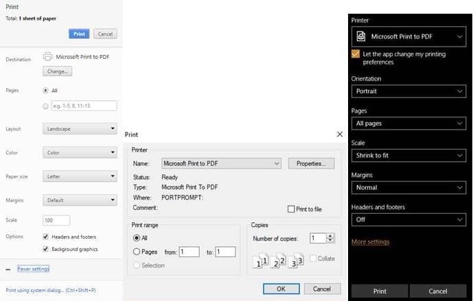
- Choose the virtual printer that will allow you to generate a PDF (in Windows 10, it’s Microsoft Print to PDF; in OSX, it’s Save as PDF).
- Change Layout from portrait to landscape.
- Tick the Background graphics checkbox (this will get the background colors of red and green to appear).
- If the matrix gets cut off at the bottom, and the slicer dropdowns are missing, close and reopen the Print, this will fix the problem and the matrix and dropdowns will appear as expected.
- Proceed with printing.
Chrome, Firefox and Edge respectively
Take note that there is no similar “background graphics” checkbox within the print dialogs of Mozilla Firefox or Microsoft Edge and so those browsers cannot be used to print or export this report with proper background colors.
Let that sink in: it is impossible to get a matrix visual to print correctly within Microsoft’s own recommended browser.
So for this solution to work, Google Chrome must be installed on each user’s machine; obviously, this runs completely counter to the alluring prospect of browser-agnostic report delivery as promised by the Power BI Service.
I could give you lots of other small examples of how Power BI doesn’t print well. In lieu of that, I’ll simply point you to Microsoft’s rundown of Power BI’s printing capability, which includes one of the best FAQ entries I’ve ever seen:
Q: My printout isn’t scaled correctly. My dashboard doesn’t fit on the page. Other scaling and orientation questions.
A: We cannot guarantee that the printed copy will be exactly the same as it appears in Power BI Service. Things like scaling, margins, visual details, orientation and size are not controlled by Power BI. For help with issues like this, refer to the documentation for your specific browser.
…Amazing.
Printing power to the people
So why does the Power BI printing experience continue to be so bad? In my opinion, it’s because Microsoft still sees SSRS as the best space in which to develop and consume “canned” reports; interactive dashboards and reports available in a tool like Power BI should only exist on a device, rather than on the printed page. “Why print out a report,” the argument goes, “when one could simply bring that report to the meeting on a tablet or mobile device?” In other words, Microsoft seemingly sees this Power BI functionality as unnecessary, believing that printing is not the point of the product. (And frankly, I don’t disagree.)
Much to Microsoft’s disappointment; however, one need only review the hundreds of comments on this Power BI Ideas forum entry to recognize that the userbase is clamoring for precisely such functionality. “Why would we implement a tool like SSRS,” the counter-argument goes, “when one could simply convince the Power BI development team to incorporate a missing feature into Power BI?”
Clearly, there’s an awkward overlap in what Power BI and SSRS can provide an organization – and I sincerely doubt that that overlap will ever be resolved. (That said, I wouldn’t be surprised if Microsoft addresses Power BI’s printing shortcomings sooner than later; it would make sense, given that the request of a print option from Power BI Desktop is literally the highest-upvoted feature request on the Power BI Ideas site at the time of this writing.)
The takeaway here is that it becomes incumbent upon the designer of an organization’s reporting solution to have a good understanding of its consumers’ various use cases. Going back to my client’s example: Power BI’s printing experience ended up not being a critical part of their use case, and so the cumbersome Google Chrome printing steps I detailed earlier were deemed sufficient. But if that solution had been a dealbreaker for my client’s userbase, then it would have behooved us to recognize that more clearly in the requirements gathering phase of the project and propose a revised architecture accordingly, incorporating a tool like SSRS.
No matter where you are in your Microsoft and Power BI implementation, you can trust Senturus for knowledgeable support. We offer Microsoft & Power BI consulting and corporate and self-paced training.
Learn Power BI. Expert instructors. Corporate & self-paced training.
If you’d like to hear more from Shawn and learn more about Microsoft’s front end tools for business analytics, check out his on-demand webinar Choosing the Right Microsoft tool for the Job. Shawn goes over the various Microsoft front end BI tools and their strengths and weaknesses. From Power BI to Excel, SQL Server 2016 and SSRS you’ll come away understanding which tool is best to use when and how they integrate together to form a complete BI framework.


