Chuck Hooper, a Senturus lead Tableau trainer, outlines how to create a Harvey Balls chart in Tableau to indicate product attribute ratings.
Scenario:
Think of Consumer Reports reviews: they have a circle with 1,2,3,4 quarters of a circle filled in, to rate a product, such as a car or appliance. The more segments filled in, the higher rated that product attribute is. How do you create that kind of chart with Tableau?
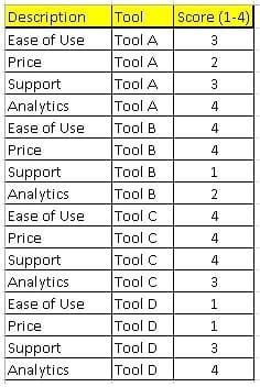
This simple example assumes you have a 0-4 rating already in the data.
Solution:
The input source data:
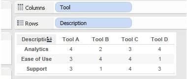
- Create this view:
- Select “Shape” from the Mark Type drop down.
- Drag the “Score” field onto the Shape button in the marks card.
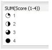
- Edit the Shape Legend.
- Select the “Proportions” shape palette.
- Assign shapes to values:
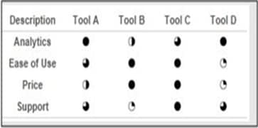
- The final results:
The result!
Tool C wins!
Interested in learning more about Tableau? Our on-demand webinar Tips for Tableau Beginners highlights tips for dashboard design with Tableau Desktop and how to use Tableau to take raw data and quickly make engaging, actionable visuals. It demos how to connect to data sources and core techniques for visualizing data using the Tableau canvas.
Need additional Tableau training? We offer beginning and advanced instructor-led, online courses as well as self-paced, onsite and custom training.
Learn Tableau. Expert instructors. Advanced topics.
Chuck Hooper’s career includes over five decades of business and IT experience. He started Tableau’s Professional Services consulting organization and was a Tableau Zen Master from 2012-2014. He conducts training sessions on the use of Tableau Software products, and does speaking engagements on visual analytics, data warehouse design, and other business intelligence topics at both the technical and the executive levels.
